Futuristic Digital Experiences Built for Human-AI Collaboration.
Interfaces where people and AI agents share one workspace: spatial layouts, role-aware personalisation and a tokenised design system shipped as code into Teams, SharePoint and Power Apps, with WCAG 2.2 AA and Lighthouse 95+ gated in CI. Success is measured in task completion and accessibility conformance rather than taste, and every component is reusable across your Microsoft estate.
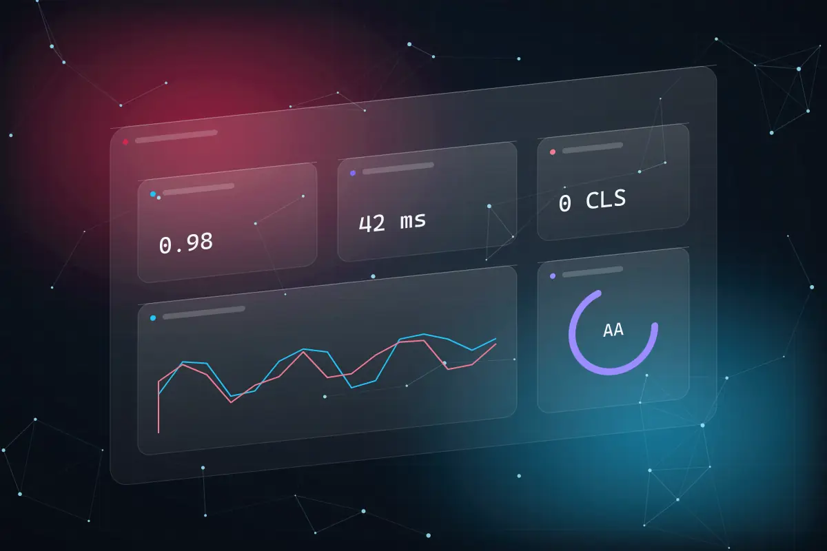
- AAWCAG 2.2 conformance targetgated at the token level
- 0Cumulative layout shift budgetexplicit dimensions on every asset
- < 50 msInteraction to next paint budgettransform and opacity motion only
- 1Source of truth for tokensevery agent, every page
You probably need this if —
- Staff route around the tool that was meant to help them
- The intranet exists; nobody opens it
- Your copilot lives in a chat window no one trusts
- Every team ships a slightly different button
- An accessibility audit found more than it should have
- Adoption is measured in licences, not tasks completed










One token source. Every surface, every agent, every theme.
A design system is a supply chain: research feeds tokens, tokens feed components, components feed the apps people actually open. Hover any node to see what it is made of, then re-tokenise the live preview yourself.
Live design-system token customiser
This site runs on the system we sell. Adjust accent, blur, glass opacity, radius and type scale, switch the whole site between dark and light, and see the generated theme block update in real time.
accent
Every surface re-tokenises from one source of truth. Change a value here; every agent's page inherits it.
Six disciplines, one experience platform.
Each capability ships as tokens, components and evidence — never as a deck of screens to be rebuilt later.
- 01
Spatial UI/UX Design
Depth, layering and motion used to show structure rather than decorate it: glass surfaces that reveal hierarchy, ambient light that signals state, and layouts that hold on ultra-wide, tablet and mobile without a separate design.
- Fluid type and space scales (clamp-based, no breakpoints in copy)
- Container-query layouts for Teams tabs and SharePoint canvases
- Motion budget: transform/opacity only, 60 fps on mid-range devices
- 02
Dynamic AI Personalisation Engines
Interfaces that adapt to role, task and context using Microsoft Graph signals and deterministic rules first, with generative models only where a rule cannot express the intent. Every adaptation is explainable and reversible by the user.
- Role- and task-aware layouts driven by Entra and Graph
- Explainable ranking with a visible “why am I seeing this”
- Opt-out per user; no dark patterns, ever
- 03
High-Performance Design Systems
Typed tokens compiled to CSS, Fluent 2 and Power Apps themes, with strict component contracts so multiple teams — or multiple AI agents — generate pages in parallel without drift. Governed like code, because it is code.
- Single token source → Tailwind, Fluent theme JSON, Power Apps theme
- Lint rule: zero custom CSS outside tokens
- Lighthouse 95+ and CLS = 0 budgets enforced in CI
- 04
Micro-Interaction Engineering
Hover, focus, press and reveal states engineered for feel and for INP: kinetic type, specular glass highlights, count-up metrics and console transcripts that never block the main thread and always honour reduced-motion.
- Interaction to next paint under 50 ms as a design constraint
- Hydration-safe reveals — nothing invisible before JavaScript
- prefers-reduced-motion respected at the token level
- 05
Accessibility (WCAG 2.2 AA)
Conformance designed in — contrast at the token level, focus order and target size in the primitives, ARIA patterns in every component — then verified with assistive technology on every release. Nothing ships below AA.
- axe-core and Lighthouse gates in CI
- NVDA, VoiceOver and keyboard-only test passes per release
- Focus not obscured, target size 24×24, dragging alternatives (2.2)
- 06
Usability Testing & Analytics
Task-success studies before build, telemetry during rollout and a monthly report your sponsor can read. If an interaction did not improve a measured task, it appears in the report rather than being quietly omitted.
- Baseline task success, time on task and SUS before design changes
- Clarity and Application Insights funnels in your tenant
- Monthly report including what did not move
Where experience design changes a number.
Three worked scenarios where the interface is the bottleneck, and the architecture that would move it.
01 · problem statement
Financial services
Advisers switch between nine tools to prepare a client review; the Copilot agent that could assemble it is buried in a chat window nobody trusts because they cannot see where an answer came from.
02 · deployed architecture
A spatial adviser workspace in Teams: client context, cited agent output and the next action on one glass canvas, with visible AI attribution, one-click verification of every citation and an approval affordance before anything is sent.
- Teams app (SPFx)
- Copilot Studio
- Fluent 2 tokens
- Microsoft Graph
- Adaptive Cards
03 · what we measure
- Review preparation
- minutes per client
- baselined with moderated sessions before design
- Citation checks
- % of answers opened
- the trust signal that predicts adoption
- Task success
- % first-attempt
- measured on the same tasks, before and after
We publish the metrics we baseline and report against, not headline percentages. Usability figures are measured on your tasks with your people, before and after, and reported monthly including what did not move.
What a workspace that fits the task is worth.
Tool-switching and re-orientation are measurable. Estimate the time your team loses to interfaces that fight them, then let us baseline it properly.
your estimate · per year
estimated value of hours returned, per year
- Hours returned per year
- 8,625
- FTE-equivalent capacity
- 5.1
Assumes 46 working weeks and 1,700 productive hours per FTE. Adoption and accessibility outcomes are measured separately and not converted to currency here. This calculator publishes the arithmetic; it does not forecast your outcome.
Baseline this with usThree ways to work with us.
Not sure which fits? The free experience review ends with a recommendation, including the case for changing nothing but the training.
- Start here · free01
Experience review
Forty-five minutes on one workflow with you: where people stall, what they route around, and what a measured baseline would look like. Nothing to install, no obligation, and the task map is yours to keep.
- Commitment
- None
- Turnaround
- Inside a week
- You receive
- Baseline & task map
- Fixed-price project02
Design system & first workflow
Tokens, primitives and accessibility gates delivered as code, then one workflow redesigned, tested with your people and shipped inside Teams, SharePoint or Power Apps. Priced against an approved scope.
- Priced
- After the review
- Change control
- Written, agreed
- Suits
- One workflow, proven
- Retainer03
Experience retainer
Design-system stewardship, usability testing every release, accessibility regression gates and a monthly report your sponsor can read. For teams shipping every sprint who need the system to keep up.
- Term
- Rolling, 30-day exit
- Reporting
- Task success & AA, monthly
- Suits
- Teams shipping every sprint
We do not publish rate cards, because a number without your workflows behind it is guesswork someone eventually has to walk back. What we publish is the method: review first, fix the price second, deliver against it third. Everything ships as tokens, components and evidence in your tenant and your source control, so the work is yours to keep and extend.
Why clients choose Congnivex, in their words.
Feedback from Congnivex engagements across Microsoft 365, Copilot and Power Platform, plus the one case we can publish in full: the rebuild of this website.
“Consistency, mostly. Every person we spoke to, from sales through delivery, said the same thing about scope.”
Before & after: this website
- Styling sources
- 1 typed token file
- lint-enforced, zero custom CSS
- Page assembly
- 8-section typed template
- agents cannot drift structurally
- Accessibility
- AA gate at the token level
- reduced-motion and focus built in
- Rendering
- Pre-rendered SSG, dark + light
- explicit image dimensions, CLS 0
The one case we can publish in full: the legacy Congnivex site versus the platform you are reading. Figures are build-time measurements of this codebase, not a client engagement.
Verification & alignment
- Microsoft Solutions Partner — Modern Workpartner
Designation earned on measured delivery performance and certified staff.
- Microsoft Solutions Partner — Digital & App Innovationpartner
SPFx, Power Apps component framework and Teams app development under one designation.
- WCAG 2.2 Level AAcompliance
Conformance target for every release, verified with automated gates and assistive-technology testing.
- Privacy Act · DPDP Act 2023 · GDPR-aligned designcompliance
Consent-scoped Graph reads, opt-out personalisation and no third-party trackers by default.
- Lighthouse 95+ budgetpractice
Performance, accessibility, best practices and SEO gated in CI on every page.
- Runs on the system we sellpractice
This site is built from the same tokens, primitives and template we deliver to clients.
Experience design on Microsoft, answered.
The questions digital workplace and product leaders ask before they book a review.
WCAG 2.2 adds nine success criteria on top of 2.1. The ones that most affect enterprise interfaces are Focus Not Obscured (sticky headers and glass overlays must never hide the focused element), Target Size Minimum (24×24 CSS pixels for interactive targets), Dragging Movements (every drag needs a single-pointer alternative), Consistent Help and Redundant Entry, and Accessible Authentication. We encode these in the primitives — target size, focus rings and keyboard alternatives ship in the component, not in a checklist — and gate every build with axe-core and assistive-technology passes so conformance is verified rather than asserted.
Build on it. Microsoft 365 users already know Fluent, and fighting it inside Teams or SharePoint costs adoption. Our tokens compile to a Fluent 2 theme as well as to CSS and Power Apps themes, so the futuristic surfaces you see on this site and the Fluent components inside your tenant share one colour, type and motion language. Where we do go beyond Fluent — glass depth, kinetic type, agent consoles — it is as typed primitives with the same accessibility contract.
Rules first, models second, and every adaptation explainable. Layouts adapt on role, team and task using signals the user has already consented to through Microsoft Graph; a generative model is used only where a deterministic rule cannot express the intent. Every personalised element carries a visible “why am I seeing this”, users can opt out per feature, and we never use engagement-maximising patterns. If a personalisation does not improve a measured task, it is removed.
By treating performance as a design constraint rather than a post-launch fix. Backdrop blur is limited to a handful of surfaces and never animated; motion uses transform and opacity only; the WebGL canvas is code-split, poster-first, paused off-screen and skipped entirely for reduced-motion users and small screens; every image has explicit dimensions in a next-gen format; fonts are self-hosted variable fonts; and pages are pre-rendered so the first paint is real content. This page is the evidence — run Lighthouse on it.
Yes — that is the point of the architecture. Every page is typed content rendered through a fixed section template; every visual decision is a token or a primitive; and a lint rule fails the build on inline styles or arbitrary values. Three independent agents built the service pages on this site in parallel against the same contracts, and the result is structurally identical page to page. The same governance transfers to your teams, your partners and your own agents.
Reviewed 6 September 2026 by the Congnivex Systems Microsoft practice · Next review March 2027 · WCAG 2.2 criteria sourced from W3C